
Rotheblog Arcade Game Shirts
Just in time for the Indianapolis auction, I got a couple of my newly designed arcade game t-shirts in the mail. I also got some professional photos taken and got a couple of those in email tonight. For now, I chose one for the ‘Rotheblog About‘ page. This may change, but for all of those who have been reading and were curious to see what I look like now’s your chance.
Rotheblog arcade game t-shirts
For about two months I had been hemming and hawing about a shirt design for the blog. There are so many cool arcade tshirt designs out there, a few of them are in my retro arcade t-shirts post. I wanted mine to be equally cool and so I finally sat down about a month ago and started designing.
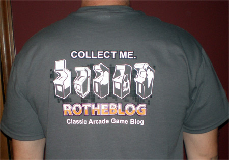
I had this idea, on the front the shirt would say ‘Find Me’ with one of those famous dumpster images with a cabinet inside, and the back would say ‘Collect Me’, with a line up of games and the Rotheblog logo.
Generic in nature, but still kind of the purpose of this site, to try to help collectors find their games and restore their artwork. I tried a number of things on the front with the dumpster image using one of my favorite’s, Mr. Do! as the target cabinet.
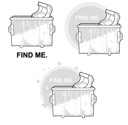
I liked the image by itself, but I felt like a t-shirt is a design that needs to be instantly recognizable, and identifiable from a distance. Meaning, the design should probably be more stylized and less detailed. Designing is really different across formats, and having done only a handful of tshirt designs in my life, the last one when I was a freshman in high school, I was struggling with the perfectionist in me to come up with the best possible idea.
The logo suggestion for an arcade shirt
Then I had a suggestion. Why not use a recycle sign on the front? I…wasn’t crazy about the idea at first, I think because it wasn’t my original idea. However, I changed the front of the shirt to say ‘Save Me’, added some distress to the design to imply age and decrepit cabinet condition and the design started to work. The universal branding of the recycle logo was what I needed to make things pop.
Here is the shirt finished;

I toyed with orange for the recycle logo, and still may try that later. It was hard to visualize how strong that orange would be so I went with a more subdued grey to pull that logo back and the cabinet forward.
Introduce yourself at the USAmusments arcade auction tomorrow
I’ll be wearing this shirt tomorrow, and now that you all know what I look like, come up and introduce yourself. Always love to meet new collectors who share an interest in this bizarre hobby. Plus, this is an easy way of doing things. I know when I have introduced myself to people in the past they are naturally a touch skeptical so hopefully this will help break the ice.
Oh, and hardly not least. Thank you to Kristen Leep for the great work on the photographs. I can’t wait to see more. Need a photographer in the Indianapolis area? You might check out Kristen’s photography at Kristenleep.com.
Here are some similar arcade posts
- New Arcade T-Shirts – Chicago Trip
- Sinistar shirt from Williams development team sold on ebay
- CHIRP – The Chipmunk Relocation Program T-Shirt
- New Multi Q*Bert Shirts are @!#?-ing Awesome!
- Beware! My Pengo overlays have arrived
If you enjoyed this post, please consider to leave a comment or subscribe to the feed and get future articles delivered to your feed reader.


Comments
No comments yet.
Leave a comment
Your email address is never displayed and cannot be spammed. If your comments are excessively self-promotional you will be banned from commenting. Read our comment privacy policy.