
Ms. Pac-man Copyright in Stencil File
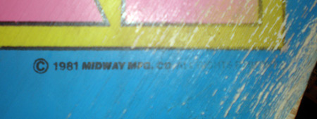
I have had some questions about the copyright text in the Ms. Pac-man color separated stencil file. If you take a look really close, zoomed in to ant sized detail, the letters look like they were autotraced. and jagged. I don’t know how these were constructed, and not inferring anything at all with this information, just being informative.

(If you are one of the ill-informed individuals that wants to use an autotrace vector program of any sorts, this gives you a visual on the results no matter what you do.) So the question posed is, should I tape over the copyrights when I stencil and leave them out? Or leave the lettering in? Here is a photo comparison of what I got, you make your own decision.
Ms. Pac-man Copyright Text
I made the decision to leave mine in. You might not be able to tell from this photo, but on the two Ms. Pac-man I had, that copyright text bled together with overspray, and was blurry in spots.
I figured, they stencils can’t be worse than that, right? I guess right, here is a photo detail of the copyright on the sideart for my newly stenciled Ms. Pac-man, it is looks great. The kickplate is the same way, crisp characters that in a way aren’t faithful to the orignal 😉
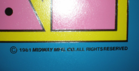
So, I would recommend leaving the copyright in….but you will kill yourself picking out the middle of a letter ‘D’ with an exacto knife. It’s the bestest.
Here are some similar arcade posts
- Ms. Pac-man black artwork – Live & in progress
- Ms. Pac-man Pink Finished
- How Bally Stenciled Ms. Pac-man Cabinets
- How picky am I? Ms. Pac-man touchup
- Breaking News: Joymonkey’s Ms. Pac-man Stencil files online at Local Arcade
If you enjoyed this post, please consider to leave a comment or subscribe to the feed and get future articles delivered to your feed reader.
Comments
Jeff, I can provide you 400 dpi scann ot the TM from Pac Man, unfortunatly it claims 1980 instead of 1981 😉
Except this is exactly the same text and typo
just lmk.
Out of curiosity, how many people besides me have noticed Joymonkey’s ‘watermark’ in his stencil file?
@Mads
Rich lint gave me a tip for arcade game fonts.
Right away I always check Helvetica. A lot of games used that font on their artwork. Beyond that, I use a website called
Sometimes it helps, sometimes it doesn’t. Some fonts, I’ve found, are some variation of the common ones, stretched or distorted or extra bolded…some variation.
@Zorg
I actually don’t know what you are referring to. Typo? Is there a typo? I’m not at home right now so I can’t do a comparison. Or are you just referring to the difference in year? You have a Ms. Pac-man that says 1980 instead of 1981?
@Brian
I haven’t noticed it….where is the watermark?
Focus your search on the right side, in the big blue ghost, in the fine details that make up the ripples of his sheet toward the bottom.
@Brian:
Ah….you mean the ‘big’ ghost….not a blue ghost. I see it now. I was like…what the heck!
Indeed a laugh…guy has a sense of humor, probably just waiting in angst for someone to find it and say something. Well Paul, you are permanently a part of my machine now…
Leave a comment
Your email address is never displayed and cannot be spammed. If your comments are excessively self-promotional you will be banned from commenting. Read our comment privacy policy.


November 11, 2008
This kind of leads me to a question I’ve been wanting to ask..
How do you find/choose the correct font for a project? Let’s say I were to vectorize a CPO. I have many thousand fonts to choose from, with font books and a viewer application. Is there an easy way, or do you actually look through them all?