
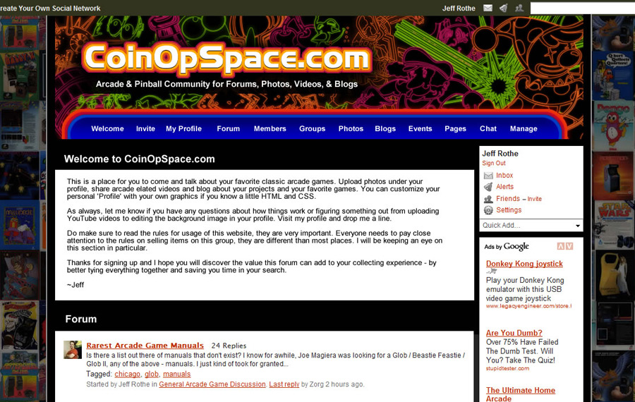
Design for CoinOpSpace Arcade Forum
I promised that once we hit 75 members at my new arcade forum CoinOpSpace.com I would do a design. I had started before we cross the 75 member mark, but today I sat down and worked really hard to try to finalize something.
I did fail in my first attempt, but that misfire led me to the second attempt which I was really happy how that turned out.
CoinOpSpace.com Header Design
I was really inspired by a designer who has did an awesome Space Invaders montage / mural and has an amazing online portfolio. The one design in particular that struck me was the ‘CMYK’ design. I thought that for sure, this is what I wanted to use to inspire the base design for CoinOpSpace.
I spent a lot of time compositing the image with different pieces of arcade game artwork, using just the simple outlines. Well, while the piece is really impressive by itself, in both black and white and in color, the space I had to work with wasn’t jiving.
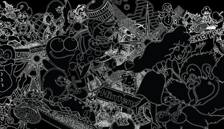
I was finding that the detail in the arcade artwork wasn’t working at the size I needed, I needed thicker lines, and more resolved designs. Without going through and taking days to redraw and resolve each piece of artwork to it’s essential pieces I decided to try something similar.
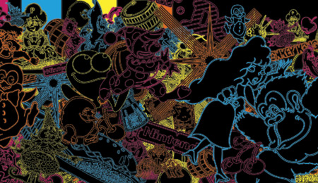
I had found that at a larger size some of the artwork piece worked. I dropped one color, the yellow, which was too powerful, and composited the new design. Click the image for a larger version.
Review on the CoinOpSpace.com Design
I will take some feedback, but in general I am happy with it. If there are really good ideas on changes for the layout, I will consider them. Leave a comment here or at the CoinOpSpace Design thread.
Here are some similar arcade posts
- Amazing Arcade Themed Illustration
- A.P.B Sideart, CPO & Marquee Reproductions
- Klov vs. CoinOpSpace (Ning) Round 4 – Directly upload images
- Visual definition of ‘bleeds’ – arcade artwork
- What’s new at the CoinOpSpace.com Arcade Forum website this week
If you enjoyed this post, please consider to leave a comment or subscribe to the feed and get future articles delivered to your feed reader.
Comments
@audiomidiman:
I took the pieces of arcade game artwork in Illustrator that I wanted and lined them up.
I did a simple slick on the tools palette to turn them to white outlines with black fills. The black fills are important to make sure you don’t see any artwork from another piece through the current piece of artwork.
Then, I chose my color palette, set some styles in Illustrator and started changing the colors of each piece of artwork, setting the strokes to around .75-1 pt. I made a duplicate of each piece, added a gaussian blur and then set it to screen and grouped it with the original. That gives it a slight glow. It might be hard to tell, but it’s there.
Thanks for the note Rich. Yeah, it would be impossible to put on a shirt…unless I had it sublimated at our shop. Maybe someday the cost will warrant doing just the Coinopspace.com text in the three colors!
Leave a comment
Your email address is never displayed and cannot be spammed. If your comments are excessively self-promotional you will be banned from commenting. Read our comment privacy policy.


November 25, 2008
Very nice. How was it created? Vector or vastor Photo Collage?