
Professor Pac-man Marquee Artwork
Turning arcade artwork into an editable vector file is relaxing for me. In a time of stress, working on this artwork in Illustrator can be soothing. Such was the case over the last two weeks. After a half hour there, half hour here I have a new finished piece of artwork – the Professor Pac-man marquee artwork.
All that’s left is the Professor Pac-man sideart
Beyond the Pengo artwork, I don’t often work on every piece of artwork for one particular game. But I’ve already done the control panel overlays which were reproduced in a short run, as well as the control panel underlay artwork.
Certainly not a ‘hard’ piece, there was really only a couple of decisions I made when working on tracing the artwork.
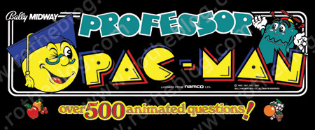
The first was whether to save a tiny bit of time and try to use the vector Namco logo from the Localarcade.com file that has all the manufacturer / distributor arcade logos. We all know that the artwork on Localarcade.com is by the general user, who may or may not know what they’re doing and may not use a good source. But the fact that I couldn’t download the file without the archive being corrupted / not complete made my decision for me. Retrace the Namco logo.
Second, there is a fair amount of text at the bottom – “Over 500 Animated Questions” – just enough to be boring to have to trace every letter, and in this case do an offset outline of each character in black.

I looked at the font and made a big assumption. I didn’t do any comparison at Whatthefont.com, I figured that the font metrics had been exaggerated at some point and I would spend a bunch of time adjusting individual curves of letters to make them match. I am a power user when it comes to vector artwork, so I just decided to manually do them all. If you recognize the font as something obvious, leave a note. Maybe it’s a pretty common font and I didn’t even notice.
The strawberry I though initially had some registration problems, but then determined that the white around the dimples in the strawberry were supposed to be highlighted, and followed the original artwork.
The only other thing I noticed was the ghost’s eyebrows appeared to be a dark grey, which I don’t think is right. I’ll have to get back with the person who scanned the item to see what color those eyebrows are supposed to be.
What’s next with the Professor Pac-man marquees?
This was a fun project but this won’t be reproduced, separations would be still be needed regardless. Beyond that, I don’t know what’s next.
Here are some similar arcade posts
- Closest Professor Pac-man font = ITC Grizzly
- Professor Pac-man Logo
- Lower Professor Pac-man cpanel artwork
- Photos of the Professor Pac-man Sideart
- Finish and repeating Professor Pac-man character
If you enjoyed this post, please consider to leave a comment or subscribe to the feed and get future articles delivered to your feed reader.
Comments
Thank you, I appreciate that. If you haven’t read my Screen Printing / Color Separations diagram, I would check that out. It’s just basically a matter of taking each color and putting it on it’s own layer, and then adding some bleeds to the artwork for registration.
Free programs for stitching photos, I don’t. Besides, I think you’re talking about stitching a grid together, vs. a panoramic view. I would doubt that what we need for large pieces of sideart exists for free. But if you find something, please comment back so I know and others do too.
Both the eyelids and eybrows are the same Blue as in The Logo and Pacs hat, but was printed the teal behind it to make it look darker. if you look real close at the orginal scan the left eyebrow has a bad resgestration issue that shows it. Unless the color corrected scan I sent didnt show this LMK and Ill send a closeup.
Ah, is that what was going on with this Prof Pac. piece. They screened that navy-ish blue down and then the teal on back to give it a darker blue. It looks really muddled in the scan, but I did see the teal poking through the ghost’s eyebrows on the tiny bit of mis-registration.
In regards to color bleed, how do you compensate?
So far I’ve found one open source/free photo stitch program with promise
http://hugin.sourceforge.net/
There is even a tutorial for stitching flat scanned images
http://hugin.sourceforge.net/tutorials/scans/en.shtml
Unfortunately I haven’t been able to stop it from scaling down the final results. A final stitched marquee should not measure 4×16″!
Hi,
the Font you didn’t care to research is of course
Windsor Bold. Exagerated, so much so, but that’s
already part of the font design.
Regards 🙂
Kadin
Indeed it is Windsor Bold. I am not able to just pick them out, thanks for your expertise…this should be helpful in case someone ever pays to have this Professor Pac-man marquee printed.
Leave a comment
Your email address is never displayed and cannot be spammed. If your comments are excessively self-promotional you will be banned from commenting. Read our comment privacy policy.


April 29, 2009
I love reading about your vectorization projects. With each new post I learn something new about the process. Could you elaborate more about what is involved in the separation process? Do you know of any open source/free programs for stitching together scans?