
Rotheblog (2.5) arcade design launched!
Within a week after I launched the brand new design for Rotheblog (Oct. 2007), I had one of those zen like “Doi!” moments. You know, kind of like that beer commercial where the one guy keeps mistaking men for women, and women for men. Ok, so less zen, and more embarassment and licking my earlobe.
After my re-launch, I started to look around more at monetized blogs and, for whatever reason, it hadn’t dawned on me that the layouts were a lot wider than 800px. I admittedly hadn’t looked at user display resolutions for quite some time. Wow! Things had changed, and if I would have paid closer attention back last year maybe I wouldn’t be launching a completely new design today.
According to W3Schools Browser Display Information, as of January 2007 54% of internet users were using a screen resolution of 1024×768, 26% were using a resolution set even higher, and only 14% were still at 800×600. Granted, I take these stats with a grain of salt as there is a certain type of user who visits W3Schools, and it isn’t my grandma. But, wider layouts are widely adopted now, and I personally believe there is a lot of truth to these stats. Have you seen an 800×600 view lately in your daily life? At the library, at a child’s school? No, you haven’t, and if you have, Oy! Chunky Chunky? Ricki Lakie? It is almost offensive how big everything looks on screen.
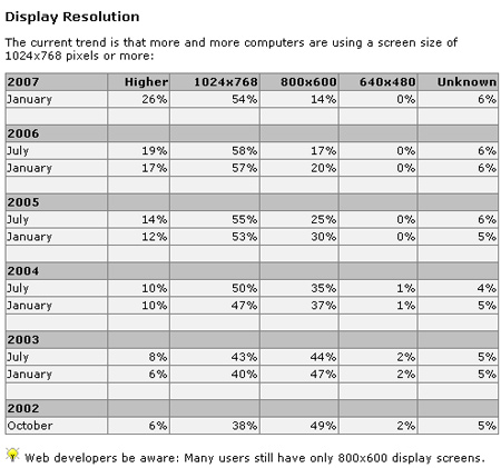
I understand the smaller resolutions for those of us with diminishing eyesight, but seriously. Back to the stat, the most telling information is the shift starting in 2006 away from the smaller monitors. It’s not so much that the 1024×768 resolution has spiked, but more that we (as digital consumers) just don’t like big fat 1990’s text anymore on those old less than ladies man looking CRTs. And again, we’re missing quarterly stats for all of 2007 and the months so far in 2008. I am sure the percentages have shifted even more.
So, I moved Rotheblog over to at 1000 pixel wide website, which gives me more areas for my posts to breathe, and a second column for information as well as space for graphical ads. Plus, I wanted to continue to focus this blog more on arcade interests and less on my personal information. I had this big plan to launch Rotheblog 2.5 to coincide with the release of WordPress 2.5. However, Automattic had other ideas, and delayed WP 2.5 at least a week and who knows when the new release will actually drop.
In terms of design, my idea was to be a pure retro design that really said “arcade games”. But I ended up moving more towards some very subtle retro elements and incorporated artwork from my favorite games, Pengo, Jr. Pac-man and Mr. Do! I figured out, once you account for readable links and a website name, there just isn’t a ton of space to play with in the header without becoming too busy. I really only did design for the top portion, I settled on the awesome WP-Premium theme to use to add my own customizations.
For those of you still wanting to read the more personal stuff and can no longer find those links, look over on the top right at the tab called “archives”. There is a complete listing of all of the categories on the website, from my Photo Galleries and Movie Reviews to my own daily news.
So, what do you think of the arcade Rotheblog design?
It is time to get some feedback from you other arcade enthusiasts. What do you like? What would you change? Are there aspects of the site that make it hard to use or confusing? I am open to all feedback to make this the best Classic Arcade blog as possible. Leave a comment with your thoughts.
Here are some similar arcade posts
- Rotheblog hits 10,000 visitors!
- Rotheblog Arcade Game Shirts
- New Website Design – Image Builders Institute
- Arcade Links for 2008-03-13
- Lawnmowerman Pac-man website online
If you enjoyed this post, please consider to leave a comment or subscribe to the feed and get future articles delivered to your feed reader.
Comments
I love the new site design, very stunning. I just reworked my website a few weeks ago (with not much change to layout) to move from 800 to 1024. Just a sign of the times.
It looks great. I need to do some work on my own, but I’m so short on time it’s not even something I can consider doing right now.
Great job on the site redesign. Very nice use of wordpress. And as someone said, the comment number indicator is tres cool.
Thanks guys, I appreciate the comments.
I have found myself messing with the theme a little more this week, when I should have been posting arcade stories. But I have a feeling that this theme will be around for awhile, so it is kind of fun to makes changes knowing that they are worthwhile and will stay.
Leave a comment
Your email address is never displayed and cannot be spammed. If your comments are excessively self-promotional you will be banned from commenting. Read our comment privacy policy.


March 12, 2008
I like your new site design…especially the comment indicator with the pac-man ghost. 🙂