
Ms. Pac-man Marquee Reproduction Versions
I can only guess that there have been a number of different Ms. Pac-man marquee reproductions floating around over the past ten years, especially before 2000 when Two-Bits officially started offering licensed artwork from Namco. I am going to go over three different versions of the Ms. Pac-man marquees in this post including detail photos of the Ms. Pac-man marquee you can purchase from Two-Bits. Check out the detailed photos and additional information after the jump.
Two-Bits Ms. Pac-man Marquees
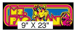
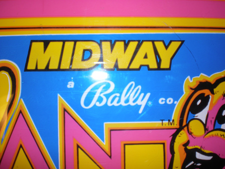
The Ms. Pac-man marquees from Two-Bits do not compare to the bad reproduction quality of control panel overlays. Their marquees are ‘fairly’ close to the original Ms. Pac-man artwork with one major difference and some smaller details, some insignificant some not. If you are new to the hobby, and are thinking about purchasing a Ms. Pac-man marquee from the Two-Bits website, here is the image you will see of the Ms. Pac-man marquee.
If you don’t have an original Ms. Pac-man marquee made by Bally / Midway handy you will think ‘Hey, that looks pretty good’. But to really make that statement, you need to have a side by side comparison of the original marquee with the Two-Bits reproduction. Below is just such a comparison;
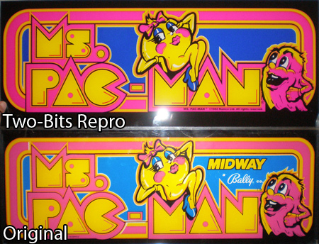
The most obvious issue is that the Two-Bits reproduction does not have the Bally / Midway logo. Instead, in the copyright you will see “© 1982 Namco Ltd. All Rights. Reserved.” Why did Two-Bits remove the Bally / Midway logo in their version of the marquee artwork? Well, for a long list of reasons. Without getting into too much depth here on the history of the Namco / Midway / Two-Bits relationship here is the basic idea.
Namco owns Pac-man, and back in the day Midway developed Ms. Pac-man without Namco’s approval. Namco brought suit against Midway for copyright infringement and as a result Midway turned over the rights to Namco. At that point, they were more concerned with their long term licensing business relationship, but additional unlicensed game variations of Pac-man including Jr. Pac-man led to the partnership dissolving anyway. Although Bally is still an operating company (Fitness among other things) they sold off their arcade and pinball division to Williams Electronics in 1988. You can see now why Namco doesn’t want Two-Bits to use either of those names in the reproductions. Namco no likey Midway, and no one wants a lawsuit with Bally over an arcade game from over 25 years ago.
What are some other Ms. Pac-man marquee differences?
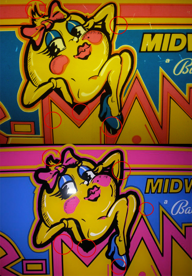
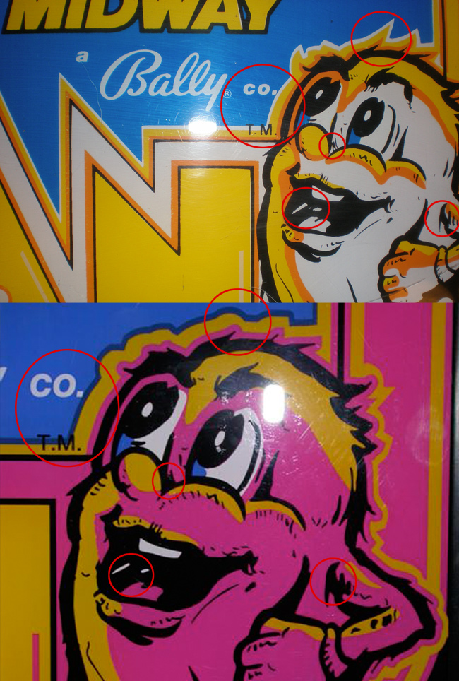
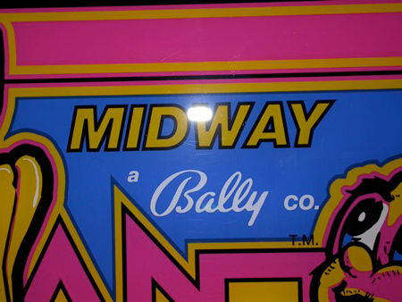
Ok, back to the Ms. Pac-man marquee comparison. Beyond the absence of the Bally Midway logos, you would have to concentrate to see the differences between the two Ms. Pac-man marquees. First, let’s compare the ghost artwork.

If we are going to be picky let’s look at portions of the artwork. Look at some of the lines on the mouth, the spikes of the Ghosts head, lines by the nose, the Ghost’s eyebrow, you can see that the line thickness, appearance and whether a piece of artwork is there or not at all are some of the differences between the original and the reproduction.
When you look at Ms. Pac-man herself, the differences a little more significant and sloppy.

There are complete white highlights missing from her legs, the eyelashes aren’t spaced out the same, the line thicknesses are wrong, there are small lines missing, some of the same sort of stuff we saw with the ghost.
These two characters on the marquee are where you will find most of the differences. There is a decent amount of accuracy in the lettering between the Two-Bits reproduction and the original marquee, the only differences being slight changes in letter thickness and the color registration is a little different. In general, the Two-Bits lines are more uniform (vector artwork), where the character of the printing inconsistencies is a little more obvious in the original marquee.
Were there any other Ms. Pac-man marquee reproductions?
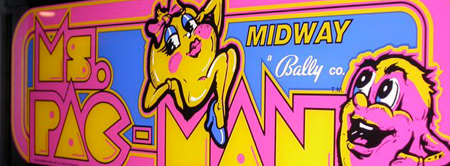
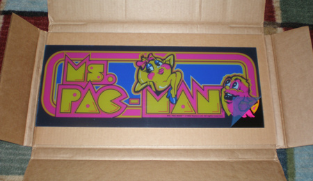
Let’s also throw into the mix some other photos of two other Ms. Pac-man marquee reproductions. One is an early reproduction that looks very similar to the marquee offered by Two-Bits and the other reproduction marquee may be even closer to the original Bally Midway Ms. Pac-man marquee if you ignore the colors. Before Namco sued Two-Bits around the release of the 20th anniversary edition of the Ms. Pac-man / Galaga combo arcade machine, there were a handful of companies reproducing the Ms. Pac-man marquees without a care in the world. I don’t know if this particular marquee was made that far back in the late 90’s early 2000 but my guess is that it was not, and whoever made it just produced a run of Ms. Pac-man marquees under the radar.
Let’s focus in on this one reproduction marquee, since I have more photos to work with 😉 This is a good-great marquee reprint, but there are some small differences in the artwork when you compare it to the original Ms. Pac.
Looking at this marquee, the main difference you will notice when holding it up to an original Midway is the complete lack of the use of orange in the lettering and outline around some of the shapes. I don’t believe leaving out the orange was a cost cutting measure because I think the orange in the original marquee was achieved by overlaying the yellow and pink. Doesn’t make sense why every piece of artwork that should have been orange is pink instead. But hey, somebody bought them right? Some of the other artwork differences are the sloppy angle at the top of the letter ‘M’, Ms. Pac’s missing back foot, the angled shapes of the hair, line thicknesses, and white highlights that were filled incorrectly with black.
The ghost has the same sort of small differences but retained a lot of the scratchy detail that gives a hand drawn feel from the original marquee. Some of the differences, the spikes in the hair as well as the line thicknesses and shapes around the mouth, arms and nose.
Small changes in artwork aside, the most obvious difference between this reproduction and the original is the Midway logo itself. The lettering is thinner, its spaced out more, and the placement of the letter ‘a’, the Bally logo, and the Midway logo is completely different than the original. Not to mention the ®sign was left out completely.
Can you notice other Ms. Pac-man marquee differences?
If you would like to see more photos of this Ms. Pac-man reproduction marquee, click on the thumbnail below to enter the full photo gallery of images that I used to identify these inconsistencies. If you find something else, drop me a line.
Final notes – Ms. Pac-man marquee comparisons.
Tired and cliche, but true – nothing beats the original. If it were me and I could do it all over again, I would always hold out for a really pink original Ms. Pac-man marquee. I have a total of 7 Ms. Pac-man marquees kicking around my house, and four of them are faded. Finding an original with pink is a difficult task, but not impossible, just be ready pay a premium of more than the cost of a Two-Bits reproduction, probably $60-$80.
If you can find the second re-printed marquee that I talked about above, I would value that one more than the Two-Bits marquee just because it has the original Midway / Bally logos. If you find one, I am sure you’ll never ever notice the missing orange and white lines.
The last resort is always the Two-Bits artwork. You noticed my comparison above, and know that I have one of these marquees myself and you’re saying to yourself, “You have such a distaste for Two-Bits, but yet you bought one of their products? What the hell?”. Just know, I got my Ms. Pac-man marquee before I really realized how crappy some of their Pac-man repro artwork was and technically, I didn’t give my own money to Two-Bits. I got the marquee as a gift, and it did come nicely packaged so I can’t make too much of a comment about handling. But based on their quality of product and their customer service I personally will not buy one of their pieces of artwork in any form again, and want anyone who is interested in Pac-man artwork to know what to expect when they get their piece in the mail.
Either way, there are plenty of reasonably priced Ms. Pac-man marquee options out there if you are looking to replace yours. I think any of the routes above are ‘acceptable’ for the general collector who doesn’t plan to have many games in their collection.
Update – June 2nd, 2008 There are a lot of small – medium size differences between the Two-Bits Ms. Pac-man marquee and the original. I thought I might show a visual of the corner radius difference, due to a mention in the comments.
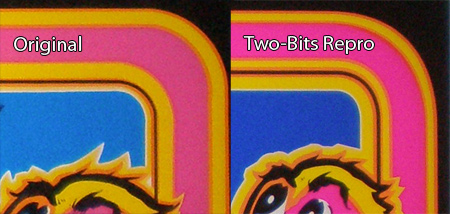
The radius on Two-Bits marquee is much more rounded than the original. In design terms, I would equate the rounding on the original to about 15% where the Two-Bits is more like 25%-30% of the rectangle shape.
Here are some similar arcade posts
- Ms. Pac-man bezel differences
- Request for photos of Two-Bits Pac-man artwork
- Ms. Pac-man overlays, bezels and Two-Bits – Oh My!
- Two Bits Ms. Pac-man Control Panel Overlay Artwork Inaccurate
- Two Bits Ms. Pac-man Bezels
If you enjoyed this post, please consider to leave a comment or subscribe to the feed and get future articles delivered to your feed reader.
Comments
@asmblr:
Good catch. There are so many smaller differences between the Ms. Pac-man marquees, it makes me wonder if the re-vector was done from a downsampled image with loss of detail.
I added an image into the post. I could go on and on, but I feel like the post is plenty long as it is, but definitely worth a mention. Did you notice that in the comparison photo, or did you know that before I did this Ms. Pac-man marquee comparison post?
@WunderCade:
It was late, but that is a pretty major detail that I missed. The ghost in the Two-Bits reproduction is indeed missing his tongue. The line thicknesses and other variances are things that we can live with, but that is a pretty big mistake.
JaySunTen was hired originally back in 2000 to do the artwork for all of Two-Bits reproductions. He had reproduced a very successful run of Environmental Discs of Tron artwork. I heard good things about him, but if he indeed did any of this artwork I would say his skills are lacking, or the supplied artwork really sucked. This conveys to me a lack of attention to detail in artwork comparison.
I just noticed it in the comparison photos. I was looking for differences and it was the first thing I noticed after the obvious logo removal. Now that you’ve posted the closeup, seems they used quite a bit different line weight and position in their border. It’s quite off. Though to be fair it’s much better than their CP debacle.
In those last two Midway comparisons – in the original Midway one, there is a small orange band around the black lining, in the lettering….
The Midway repro does not have that orange band.
Also, on the original marquee the C in PAC creates a bump on the bottom of the colorful part of the marquee (into the black area), but the Twobits is smooth.
The knees on Ms. Pac on the earlier repro are a bit sloppy, the highlight on the other arm is filled with black, there is an extra spike on the left side below her bow, and some other nitpicky things. If you want me to tell you everything, I’d gladly do it!
I believe that newer repto is from Phoenixarcade and hey are still selling these.
Leave a comment
Your email address is never displayed and cannot be spammed. If your comments are excessively self-promotional you will be banned from commenting. Read our comment privacy policy.


June 2, 2008
The rounded rectangle around the border of the marquee is also different. The corner radius is different, leaving the twobits marquee much more rounded than the original.