
Differences in Pengo cabinet artwork
I have had a number of questions here at Rotheblog about the different pieces of Pengo artwork, and a lot of the comments make logical guesses as to which set of marquee, cpo, bezel and sideart go together. Well, I sat down and took a closer look at the artwork and these are my thoughts on the two different version of Pengo artwork.
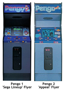 Everyone has seen these two cabinet photos off of the Sega flyers. The first image is from the illustrated flyer with the tagline – “Player appeal makes Pengo the game for everyone”, and the second image is taken from a lineup of Sega games with the title “You can bank on Sega’s new lineup”. It was the image from the ‘Appeal’ flyer that has caught my interest in the past because this is a rare Pengo bezel that I have never seen anywhere else, more than likely a prototype that never made it out of on location testing. However, the alternate version of the Pengo sideart is a primarily darker blue base kind of like this bezel, so maybe it is floating around out there. Anyway, on with the comparison
Set 1 of Pengo artwork
This is the set of Pengo art that I thinks goes together as ‘Set 1’. Just to point out a couple of the main indicators…
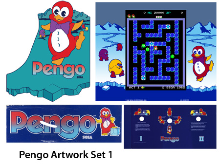
Look at the eyes. In this version Pengo’s eyeballs are blue with the Pac-man style cutout to give a illustrator’s version of an eyeball reflection. The blue itself is usually not any larger than 1/3 of the space for the whole eyeball and it never touches the sides. The surrounding areas are white, and the general expression is all the same, sometimes including eyebrows that are just curved lines.
Plus, the other really telling artistic detail is the choice of rendering on the purple bow. In the Standing marquee, the Numerals overlay and the traditional the bow is bulbous, and if there are any ‘knot’ lines, they curve with the circumference of the middle knot and are on the knot.
A smaller detail that you will notice is the rendering of the ice cubes. In the ice cube in the numerals overlay and the standing Pengo marquee, you will notice that they are thick blue lines, broken in place to add interest, and thick highlights to indicate the ice’s glossy surface.
Since the bezel that everyone knows uses the exact same artwork as the Pengo sideart, just re-apportioned, I am putting the bezel in this group.
Set 2 of Pengo artwork
Using the same criteria, here is the second set of Pengo artwork that goes together.
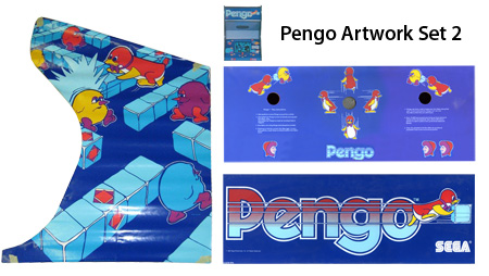
Look again at the eyes. The eyes are still blue but there is no highlight, the blue always takes up about half of the eyeball, and the blue always touches the sides. If Pengo has eyebrows in this version, they are oval like with a little splash of red in the middle (a hollow oval you could say)This is consistent across the alternate Pengo sideart, the original Eskimos overlay as well as the pushing ice block marquee. Although Pengo is pushing ice into the Sno-Bees on the numerals version of the overlay, you will notice in all of these pieces of artwork Pengo is pushing ice into the Sno-bees, and most of the time it is from an angled point of view.
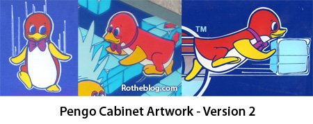
Onto the lines in Pengo’s purple bow. If you take a look, there are always knot lines that are sometimes fragmented, but they are always in the bow portions, not on the knot. The artist sometimes used the negative space of the wrinkles to imply the shape of the knot, instead of always keeping it as a rounded rectangle sort of shape like we saw in the other artwork.
The final piece is the illustration of the ice blocks, and I found this to be the most interesting. The artist of this set of artwork chose to imply the block edges with two lines right next to each other. This is a more accurate portrayal from an illustrator’s POV because it implies that there is a thicker radius on the edge of the ice cube, which there realistically would be. The ice highlights are on the edges of the blocks in the Eskimo cpo and the alternate sideart, not on the face of the cube like there are in the first set. However, I do find it a little strange that the artist still renders the blocks in a harder edge fashion than the other Pengo artwork set.
Based on the fact that we have a tiny image of the alternate bezel that is a dark blue, I will put the second version of the Pengo bezel into this category.
Who can notice some other artwork differences?
I am sure there are other differences that you might be able to notice when comparing the ice, the mountains, or the Sno-bees, but I wouldn’t think it would be as obvious as the differences in rendering our title character Pengo. You would think it would be easy to separate the two sets of artwork by how the ‘Pengo’ logo text was rendered, but even that isn’t consistent with the artwork. Both versions of the Pengo marquee, the numerals version of the control panel overlay, as well as the predominant sideart all have the gradient logo version, red to blue. The original Eskimos cpo has a flat light blue fill. Very strange.
I emailed Dan Hower at ArcadeFlyers. We’ve been in touch before, and he’s been a great help for artwork. I am going to try and buy one of the Pengo flyers that has the alternate bezel to see if I can see even just a little more detail than the 72 DPI scan that is on the website. But either way, this is how I think the breakdown of the Pengo artwork should go. It may have been distributed differently, but having an Illustration degree, I know a little something about artist style. It is very hard to just fake a different style, so I really think that maybe one illustrator was an understudy of the other, or maybe they worked hand in hand because the drawing are so similar. But still, some small differences if you look close enough.
Here are some similar arcade posts
- Pengo CPO Vector Update 3 – Tracing Complete!
- Scanned Both Versions of Sega’s Pengo Marquee
- Pengo CPO Scanned
- Finding The Rare Pengo Bezel
- Pengo Numerals CPO Vectorized!
If you enjoyed this post, please consider to leave a comment or subscribe to the feed and get future articles delivered to your feed reader.
Comments
Keep in mind that it was very frequent that prototype or cobbled together machines were used for the flyer shots.. What you see on the flyer is not necessarily what hit arcades in droves. Perfect example is the pengo CPO.. the roman numerals were in reality released as a replacement CPO. The eskimos were on actual dedicated machines.. Another example is Defender and the now famous proto art seen on a few flyers before it’s release but only found in the wild 2/3 times. Even Donkey Kong/Mario Brothers have variants of the art found on the flyer that are not easily found in the wild.
Yeah yeah, sure sure. The best thing I can compare this to in my own personal experience is Stern’s Spiderman pinball. I know when I played it at it’s supposedly ‘secret’ test location in Chicago it had some unfinished artwork on the playfield that later changed. And I also know from working in a firm that makes a product that sometimes you have to advertise to get the word out before a product is in hand and finished in even the most minute respects. Just seeing some stories about the sometimes haphazard work environment and planning of Atari, I would assume some of the bigger or smaller players, including Sega, would have been similar. A couple of guys in charge of Pengo design game architecture, a guy doing Pengo artwork, some guys in advertising in sales pushing deadlines…etc. etc.
You didn’t make any comment on the head shape. All of the examples in Set 1 have a peak in Pengo’s head, an unruly feather of some sort. From head-on (CPO image), it looks like a point, and from 3/4, it is drawn like a tuft sweeping forward, a la Fred Flinstone’s hair.
Geoff….nice catch! That was probably so obvious and I was looking too hard that I didn’t even notice that! Very cool observation and a pretty big stylistic difference that does set the two Pengo types apart.
Leave a comment
Your email address is never displayed and cannot be spammed. If your comments are excessively self-promotional you will be banned from commenting. Read our comment privacy policy.


July 2, 2008
That makes sense weird how they got so mix-matched iver the years. including Ricks HUO. but obviously from the flyers tat looks like that was the layout to bad no sideart shots.