Updated Website – Tokens Only
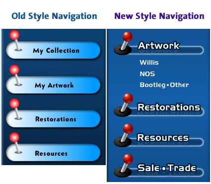
Chris Moore and I had been talking, and now that he is sharing some great arcade information with some regularity on his Tokens Only arcade blog he was finding that there needed to be some changes from how he thought his website would be structured. Since his navigation is image based, that meant some changes to the buttons and I thought this a perfect time to do an update on the joystick that the original designer made some 2-3 years ago.
Red Sun or Joystick Ball?
I think it is ingrained in designers to naturally not like another designer’s work if they don’t know them. If I know you, hey, you design the best work in the galaxy. But you could be hired by Universal Studios and if I don’t know you then something about your work is junk 😉
Not really. But that brings me to my example here. I was never in on the original design talks but I always felt like the original navigation elements on Tokens Only looked a little amateurish. Granted, you knew they were joysticks that flipped when you rolled over the links, but the joystick was represented by a red circle with a white glow, smack dab in the center, and the stick was just a white line. Plus, how does a white to blue gradient rounded rectangle relate back to arcades or a joystick in general?
So I update the joystick icons on the Token’s Only WordPress theme to make them look a little more realistic. Granted, the shaft is a little more chunky than a joystick might be but just like any round object, the ball now gets a more color realistic reflection from the top, and a reflection from the bottom of the material below it. Check it out;

These small details in design have always been important to me. If you are going to represent something in real life, understand how that object interacts with light and other parts of its environment. The rest of the design with the glowing oblong rectangles, the outlined text and the reflections of that text are all really design preferences, they don’t necessarily have anything to do with arcades. However, I do think that any thin lines that glow remind me of vector games a little bit.
Love those rotating arcade flyers
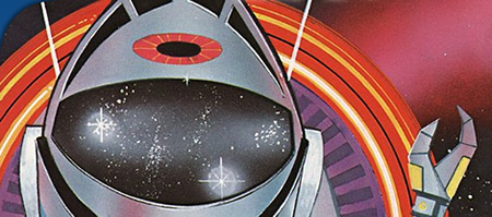
My favorite part of Chris’s site is the rotating cropped image from an arcade flyer of his choosing. Most of the flyer images are from games Chris had, has, or are just his favorite from Berzerk and Asteroids to Ghosts N’ Goblins and Missile Command. However, to get that rounded effect, we need to include part of the blue in the upper left corner.

So that meant some 20 odd images had to be updated. Why? Well, I also didn’t like how dark the original designer made the gradient for the blues, they were almost black so I change the fade to give the left side what I would consider a richer color.
There are a couple more things I would do to this website if it were mine completely, mostly smaller things. But we’ll just have to see how things progress. The original ideas of the design have changed significantly, as websites do, over the last 3 years. Hopefully as his site grows with some of the best content I’ve seen so far on more common classic arcades, some of those other details can flesh out as well.
Here are some similar arcade posts
- New Arcade T-Shirts – Chicago Trip
- Bootleg or Willis Mr. Do! Artwork
- Own a Frenzy arcade game? A couple of questions for ya.
- Pengo Numerals CPO Vectorized!
- Beware! My Pengo overlays have arrived
If you enjoyed this post, please consider to leave a comment or subscribe to the feed and get future articles delivered to your feed reader.
Comments
@Chris A:
So you think the excerpts on Tokens only should be a bit longer huh? I haven’t heard that before, but to each his own.
There are a lot of subtleties to blogging, one being that opening paragraph that sells the post. I am just really happy that Chris is starting to share his arcade knowledge. He can pick up some of these things as he goes, and one of them is always writing that intro paragraph to seem like a stand alone attention grabber.
I think Jeff is absolutely correct with his observations of the original design. I paid a whopping $100 for it through elance, a place I run a lot of data entry jobs through and I guess you get what you pay for. The whole thing really didn’t get moving until I started talking with Jeff. He’s quite adept at pulling you into the WP world. I’m enjoying the learning experience and will make an effort to make my opening paragraph a little more attention grabbing. Thanks for the comments.
@Chris M:
Hey, I had no idea the original Tokens Only design cost only $100. You can’t beat a designed / fully built website for that price. I know I can’t. But it is true that $100 doesn’t account for a designer to truly know your website, the product you sell and the type of message you are trying to get across.
Planning a website properly is important to, and thinking about future expansion and even when you do a stellar job in my experience only 90% of the website will still be the same after the first year.
Leave a comment
Your email address is never displayed and cannot be spammed. If your comments are excessively self-promotional you will be banned from commenting. Read our comment privacy policy.


September 28, 2008
Nice work on the design tweak, the site has a much more ‘solid’ look to it.
Personally, one additional thing I’d recommend Chris do is excerpt a bit more of each article on the front page, to give readers a chance to become hooked on an article they may not have sought out to read.
Contest-wise, I’m really enjoying it, and it’s a welcome addition to the feedlist.